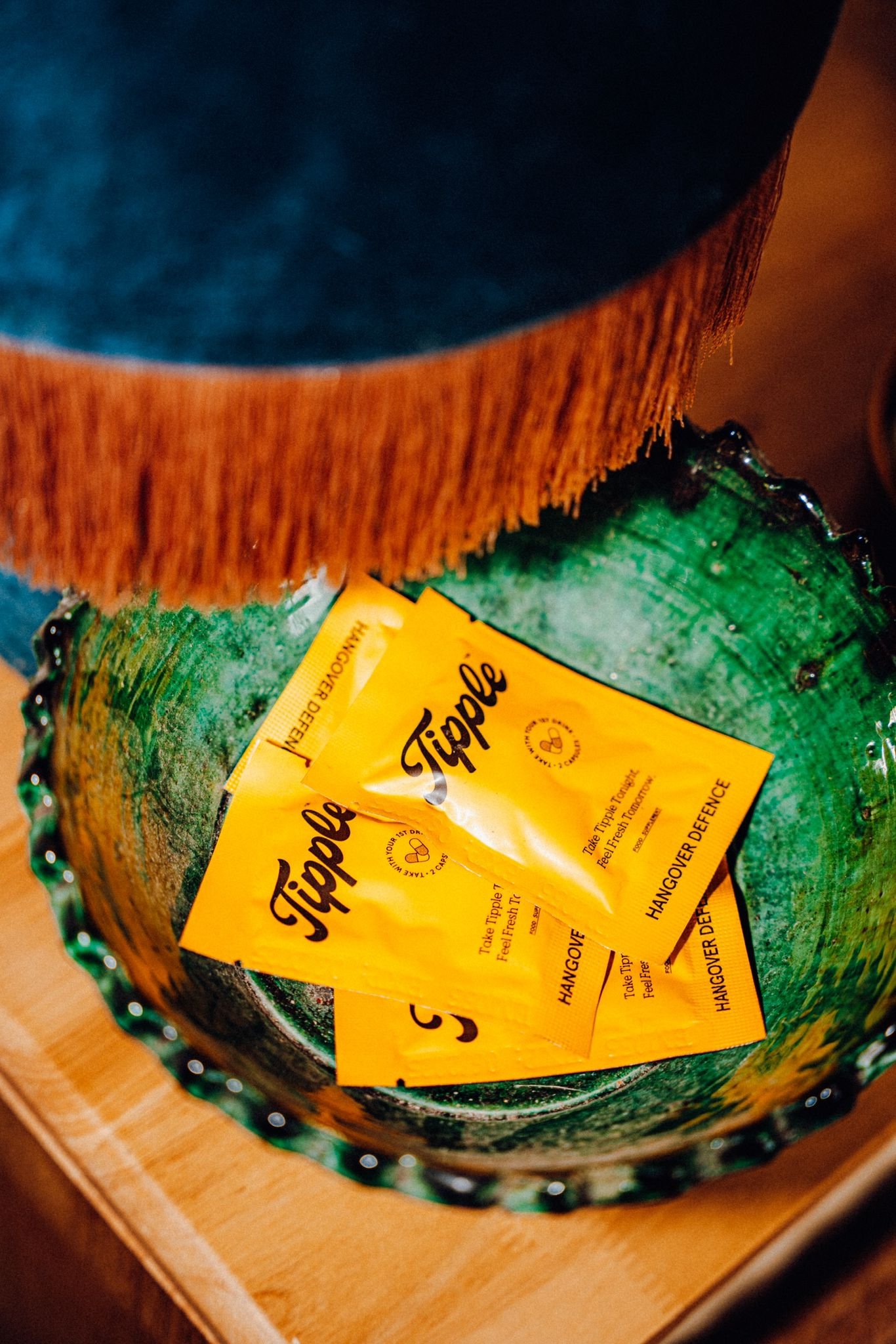
Raise a glass to tomorrow.
Tipple is a hangover defence supplement, taken when you drink, that leaves you feeling fresh the next day.
Task:
With the hangover supplement space in Ireland being very niche, Tipple wanted to differentiate its self from the other typical medical-driven brands in the category and carve out a new space for itsself.
Approach:
A lifestyle-drive approach with a touch of nostalgia set the tone for Tipples new look. A balance had to be struck between a trust worthy product and a laid back, playful brand.
Scope:
Branding, Art Direction, Packaging.
The brand centres around a whimsical and playful script with a touch of nostalgia. This softer approach helped Tipple differentiate itself from its limited Irish competitors.
The packaging doubles down on the brands hero colour and displays all information in a confident and modern way.
The digital side of the brand takes a more playful approach, introducing a cast of happy, and active characters. All representing the feeling of taking back your weekend and beating that hangover.


